5th of October 2025: New UI In The Works
Oh boy, this is gonna be fun...
What Do I Even Put As The Section Title
So, I got curious, and decided to make a website design from the ground up.
I know, scary, scary, and it was. And still is, because HOLY SHIT does working with Flexbox suck, which for some reason I thought would be better. It was not. It doesn't work with PetraPixel's layout.js thingy, either.
Ok, so, the old website design. Here, have a photo for reference.
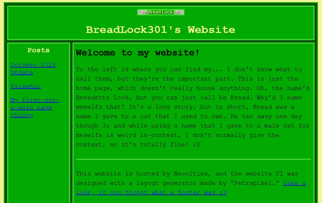
In this UI, there's the header, which has "BreadLock301's Website" in it, with a cute lil' blinkie at the top to serve as the homepage button (y'know, the button that takes you to the homepage.) Then there's the navigation bar, which simply contains the posts I've made. There's the footer at the bottom, which isn't visible in this photo but it just links to the layout generator. And then the page content, which is where, well, the content is in.
Right off the bat, there's the issue of the navigation bar's size. The more posts I make, the longer it's gonna get, until you have pages that have a really small amount of content in them but has a really long navigation bar.
Another thing is the website scaling. I appreciate PetraPixel's dedication to making the sites generated with the layout generator easy to use, modify, and to display well on various devices, but it does make it a bit harder to modify outside the context of the layout generator. Plus, specific modifications to certain things (say, I want the left and right paddings of the navigation bar to be larger than the top and bottom paddings) requires one to either ditch the practicallity of the variables in favour of a quick modification, or to put in the spare time to add new specialized variables for those things. To be fair, doing the latter isn't hard, but.
...OK I don't have an excuse for this one, you win.
But uh, I don't really like how some of the website scales. It feels like it has a lot of empty space, and while it probably looks fine on larger displays, it would be nice to make the UI more compact. Figuring out how to do this is probably going to be a nightmare, though.
I just wanted a more clean, fresh look to the site, really.
And so, that's what I set out to do.
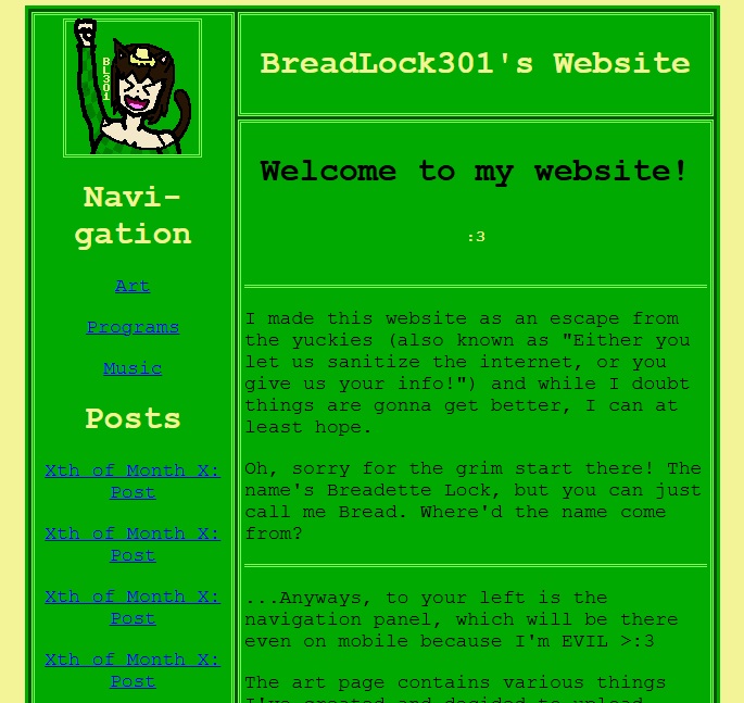
First of all, this page is a bit narrower. Or, depending on your display, too narrow. Or perhaps even too wide to fit. Sorry about that. But that's because the contents of this site fit within the nice, retro width of 640 pixels. I might change this to be percentage-based, but for now I think it looks quite nice.
Another thing I did was replace the blinker homepage button with a larger homepage button, which is a slightly modified variant of the image used in my pfp's across the few accounts on various sites I own (minus my YT pfp, which is still Clippy lmao.) If you ever wondered what I look like, well... At least, this is what I imagine meselfs looking like.
3:
Also, the navigation bar now cuts into where the header was, so that I could have the homepage button be in that space. Also also, while not visible in this screenshot, the navigation bar has a scrollbar! This took me way to long to find a solution for, but basically I gave the navigation bar the position: relative property, and then created a <div> tag inside of it with position: absolute;, padding: to be the same as the navigation bar's padding, and overflow-y: auto; so that the navigation bar wouldn't grow larger than the main page content, and the contents inside the div would gain a scrollbar. Yeah, dunno if I can explain it that well, but it works. It really does. Maybe.
Finally, I decided that having some extra pages for certain kinda of content would be wise, so that they aren't lost in the depths of dozens of posts. Just a QoF thing, really.
Now of course, this is just a concept I made from the ground up. And while I designed this website with Grids originally, I thought that the Grid implementation wouldn't let me maket eh navigation bar scrollable, so for some reason, I decided to re-make the website using Flexboxes, which was really difficult and confusing to do, just to find out that the most practical solution worked with Grids, too.
My ultimate plan, then, is to brutally gouge out the contents of PetraPixel's style.css file and modify it to have the bare minimum amount of formatting neccessary for my needs, and probably make a minor adjustment to the layout.js file to get rid of that jump to header button. I do also need to comment out all pages that load in the css file before the cachebuster cache busts, so. Fun!
Hopefully after that, I'll have a much nicer website UI that doesn't require me to make changes to any of the sites I've already made.
Don't worry, that blinkie will still be there, it'll just be in the footer instead of the header. I SAID DON'T WORRY!!!!